Background
The Growth Hub was set up to help businesses across Gloucestershire to maximise their potential through free business support, training, events and consultancy. While they weren't looking for a wholesale change to their brand, they wanted to develop it further and approached Mighty to create an extended brand and supporting collateral that would help tell their story to businesses in the region and key stakeholders.
Growing a brand
While the overall logo wasn’t changing, we want to give the brand more flexibility, so we started by developing a more robust secondary colour palette, choosing contemporary bold colours supported by bespoke polygon-style patterns. We defined enough colours and patterns to support the Growth Hub’s Super 7, the organisation’s model of support based around key business areas.
We further brought this aspect of The Growth Hub’s offering to life by developing line-drawn icons. Working in isolation or designed to be joined up, they were conceived to represent the long-lasting impact that The Growth Hub’s support has on the life of a business.
Making a hub a home
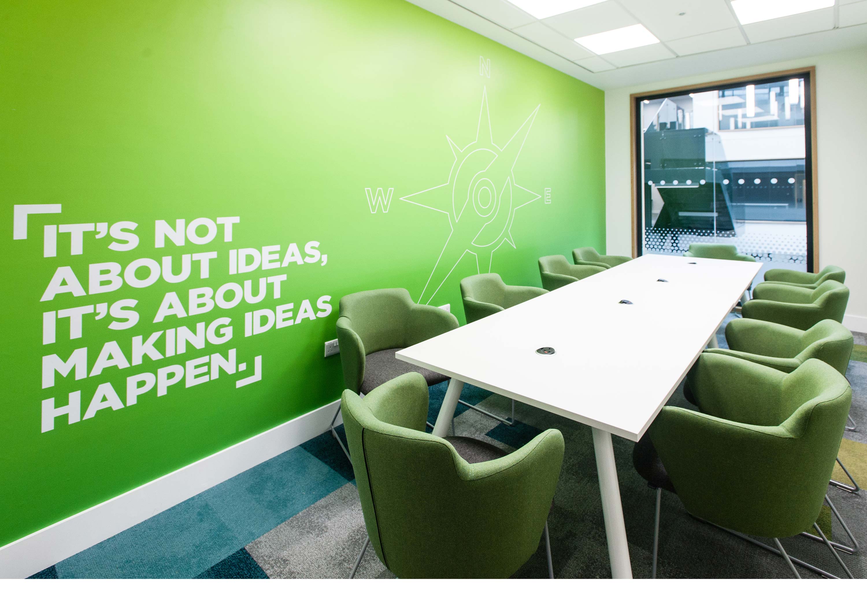
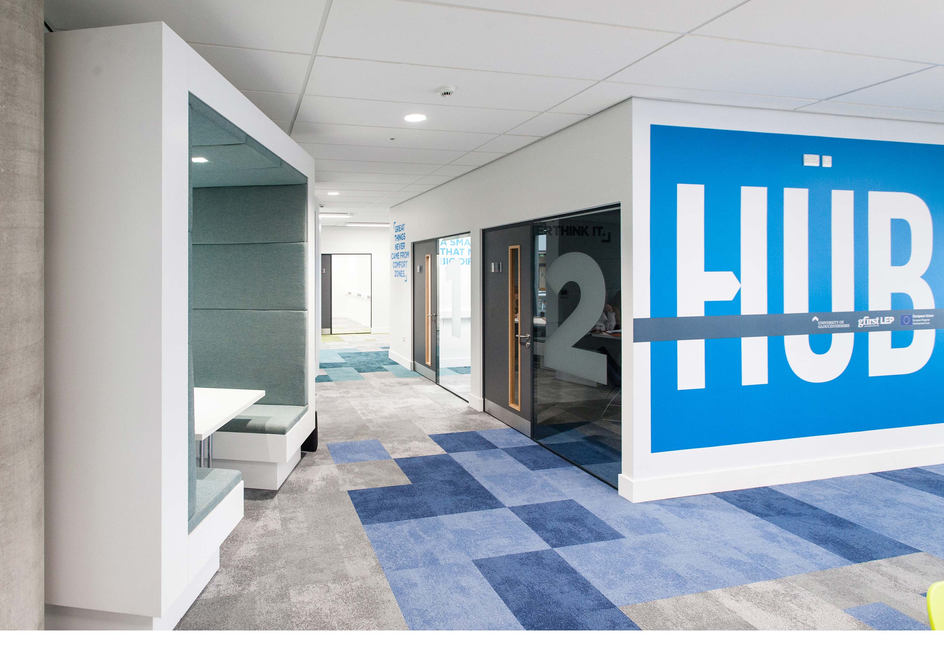
Following government investment, The Growth Hub moved to a brand-new purpose built centre, and wanted to really bring the space to life for local businesses. We created bespoke wall graphics, using inspirational quotes and developing The Growth Hub's very own mascot, the Growbot.
These quotes and illustrations were positioned strategically around the facility against bold coloured backgrounds inspired by our new brand palette.
Bringing clarity to companies
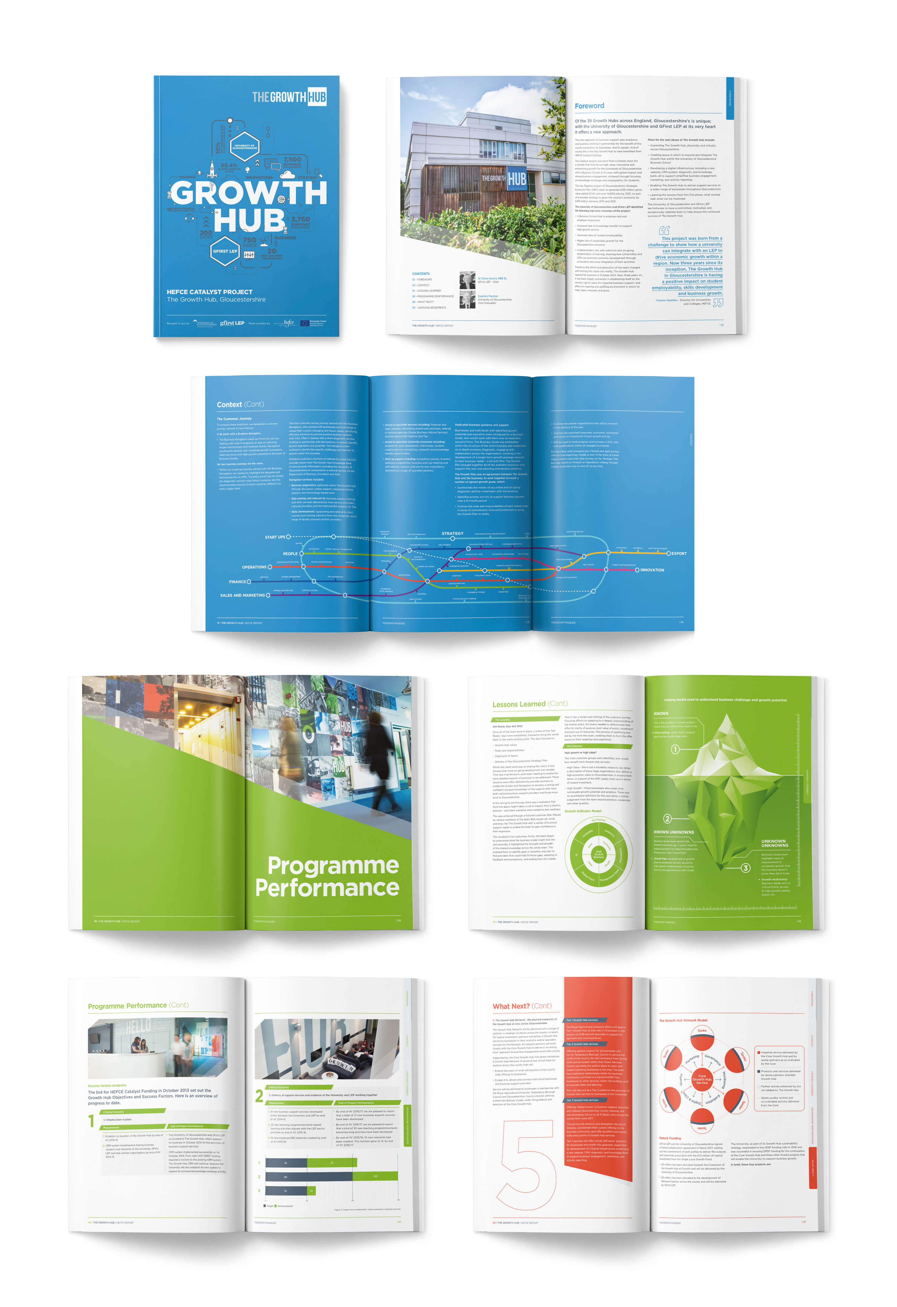
When it was time for The Growth Hub to report back to HEFCE to show how the funding they’d received had been put to good use, they turned to us to develop a stunning publication that demonstrated the clever thinking and unique approach that has led to them achieving some of the best results across the country.
We were determined to ensure that we created a design that not only complemented the work we'd already developed, but a style that would allow the results and key information leap off the page. We developed striking infographics to make it easier to read and utilised our new bold colour palette throughout.
We incorporated our line-drawn icons, giving life to pages that might have otherwise fallen flat, and created a ‘wow’ roll-fold element in the centre of the document to fully incorporate The Growth Hub’s tube map-inspired business journey diagram. Mighty’s in-house content team also proofread the full 60,000-word report, helping The Growth Hub’s marketing team to shape and structure the copy and flow in a way that would make the report easier to digest.
Collateral that means business
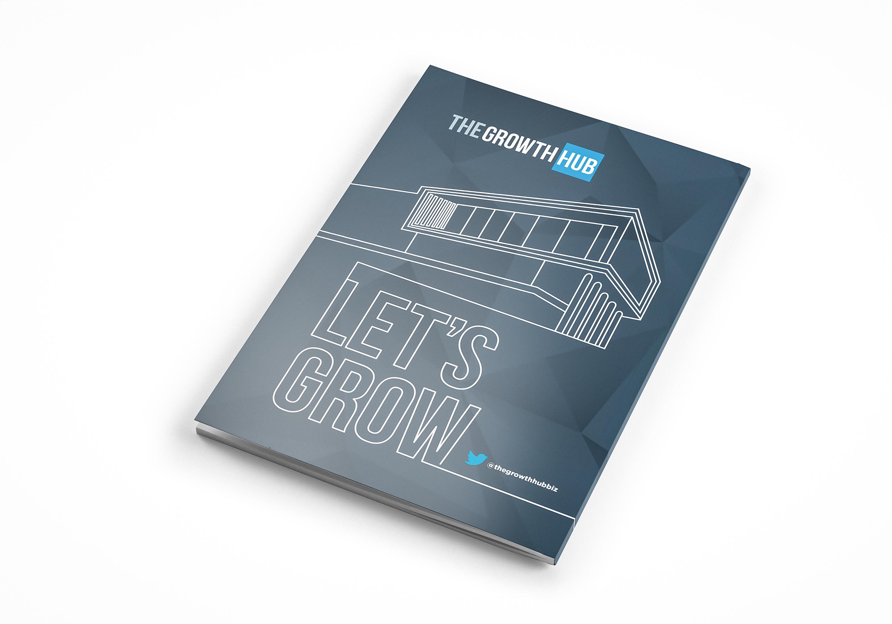
Throughout our time working with The Growth Hub, we’ve also supplied panel designs for local business exhibitions, full-page adverts, and when they reached the next stage and moved to a purpose-built building, we supported them with clever collateral that explained the services they offer.


