News
Website Bounce Rates Are on the Rise
Website bounce rates are starting to increase considerably, especially on shopping sites. What’s to blame for this new trend?
High bounce rates are making a comeback, and that isn’t good news. If someone ‘bounces’ from your website, it means that they visit one page and then don’t view any others before moving onto a different site. In terms of brand loyalty, think about it this way: the higher the bounce rate, the less people care about what you have to offer.
But why are more websites experiencing a higher bounce rate? Simply put, a lot of it is down to poor mobile design. As more people browse solely on their phones or tablets, rather than on a desktop, they’re more likely to bounce off the page if it doesn’t scale properly or load quick enough. In particular, shopping sites that hold lots of products are experiencing the worst of this – according to a recent study, up to 75% of users are bouncing off when they hit a product page directly from a search engine, rather than finding said product via the website in question.
If you have products on your website, it’s really important to make sure those product pages are well laid out on both mobile and desktop, have prices and descriptions readily available, and feature the best product photography possible. It also needs to be easy for people to find their way around your site to click to view alternative products or get further information about your company.
If you don’t sell products, it’s just as important to make sure that each and every page on your site is relevant to the user. Keep on topic, make it easy for visitors to find the information they need, and help them to find and navigate to other, relevant areas of the website.
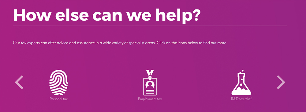
We recently developed a website for Cheltenham accountants Randall & Payne. They offer a wide range of services, and it was important for their users to be able to find out more about those services, rather than just the one they landed on. Therefore, we introduced a carousel of icons that used quirky imagery to easily link to other relevant services in those sections:

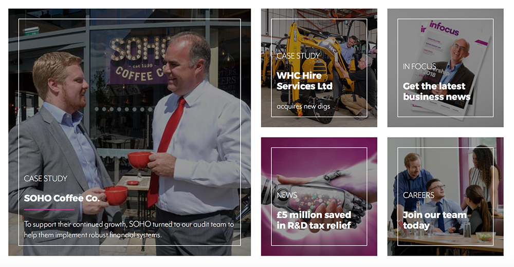
We also added an information hub to the bottom of key pages, so we could highlight important news, events or services:

Both of these features allow visitors to move around the site with ease and find out more about the things that matter to them. As a result, we’ve seen bounce rates substantially decrease by 16%.
Get even more digital marketing news and views:
- Can voice technology create an even better brand experience?
- YouTube to scrap 30-second unskippable ads
- Digital ad spend overtakes TV for the first time in USA
Found this helpful? Sign up for our newsletter!
Our monthly newsletter brings together the best of our blogs, work and news in one handy email. Why not sign up today to find out more about all things social media, PR, design and digital?


